
Reimagining the online account management experience
The experience for the previous account management system was exactly what you think of when you think of dated financial web interactions—busy, unattractive and not intuitive. Worst of all, it was not responsive and thus almost unusable to a large percentage of users.
It was great to be able to bring this system back in to our era through our redesign. Although there were some technical constraints that prevented us from completely throwing the existing system out and starting over, we still were able to work with quite a bit of freedom to imagine something better for our client and their customers. Here's some of the process we took to get there...
Mind mapping my way to an IA
Knowing this web app would be integrated with the new CitiFinancial.ca we created for them, we wanted things to feel as seamless as possible to the user. Having conducted requirements gathering sessions with the client's technology and marketing teams, we had a clear idea of what was needed, so I began to do some mind mapping to document what was needed and how everything related.
From there, I could make a more digestible IA to present to the client and iterate based on feedback and based on insights from user input on the previous system.

A rough mind map of the elements this application would need

The IA for the app
Documenting the flows
Becuase we already had a UI kit to leverage, we pretty much jumped right in to design once we were aligned on the architecture. Before I did that, I wanted to map out and document the flow of various interactions.


Getting in to design
As mentioned, we had a lot of our previous design work from the website to leverage for this web app. This allowed us to quickly move in to higher fidelity designing and prototyping. Having said that, the types of interactions happening in this web app were considerably different from anything we created previously, so a lot of new patterns were established in the making of this web app.


The desktop view of the account summary screen
Prototyping and testing
We used InVision heavily for this project to test out our ideas right on the devices that would be used. We also did some 'guerilla user testing' within our office to get some immediate feedback as we were designing.
In addition to this, we did a few small animation prototypes prior to folding things in to the final developed product. A few rough samples are shown below.
Rough animation tests
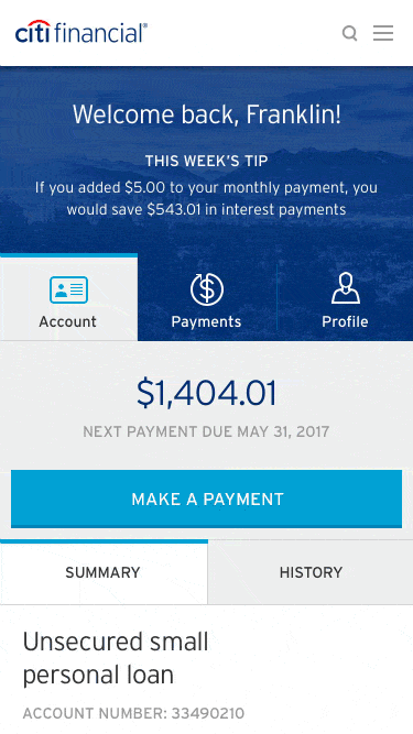
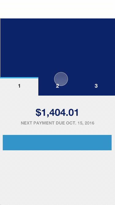
Before/After
