How it began
When I started at Mattermost, the team had not yet solidified a system to encapsulate their products' design principles, guidelines and standards. After only a few months into the job, I took the initiative to get a design system off the ground. Thus began the journey to build what we called the “Compass Design System”.
During a week-long team meetup, I rallied the team around this and we began getting to work on it.
Establishing the framework
After much research exploring some of the gold-standard design systems out in the wild (Google Material Design, Atlassian Design System, and Adobe Spectrum to name a few), we started pulling together a framework for how we wanted to bring it all together. We settled on a system that resembled the pieces of Brad Frost’s Atomic Design methodology, with some modified terminology. The framework started to coalesce around a hierarchy of Foundations, Components, Patterns, and Templates
Foundations
Foundations are the most basic building blocks of the system. They include guidance on things like color, typography, or iconography, and can also include other aspects of interface design like layout or animation.
Components
Components are reusable building blocks that make up the core elements of the interface and leverage the Foundations. Each component meets a specific need and helps to establish consistent, intuitive user experiences.
Examples of Components include Buttons, Tags, Tooltips, or Messages.
Patterns
Patterns are typically larger building blocks made up of multiple Components. Grouping multiple Components together allows for more complex interface elements that solve common problems.
Examples of Patterns include the Channel Sidebar, Channel Header, and Right Sidebar.
Templates
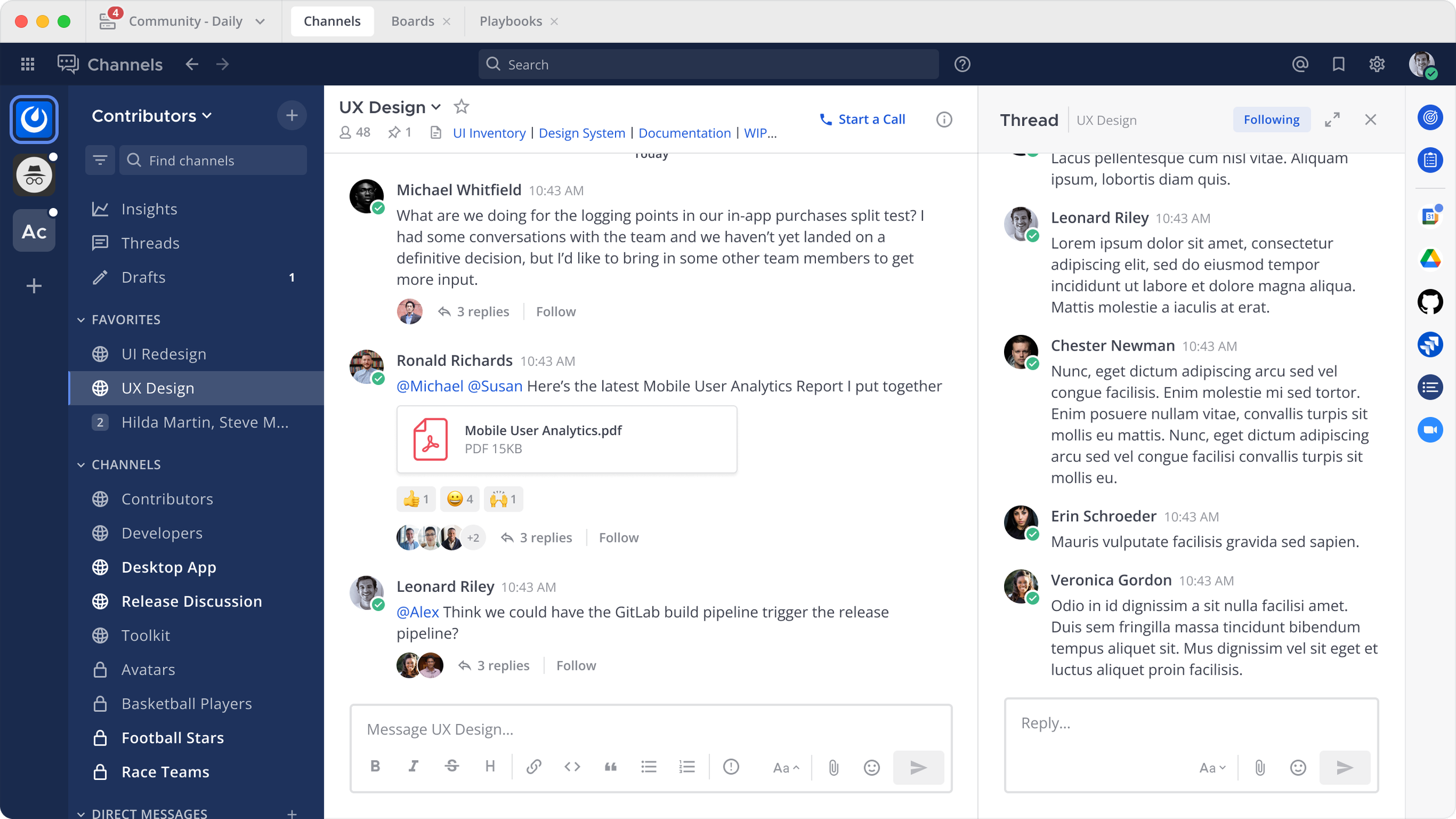
Templates are full layouts made up of multiple Patterns and/or Components. A Template is a demonstration of all the parts of the design system at work together on one screen.
Template - the full app layout with all pieces assembled
Building out the elements in Figma
In an effort to gain momentum, once we established the hierarchy we quickly began building out the foundation styles and then moved into the components.
We prioritized the most-used components first (like buttons and form elements) and were able to realize value immediately as components were being published to the library.
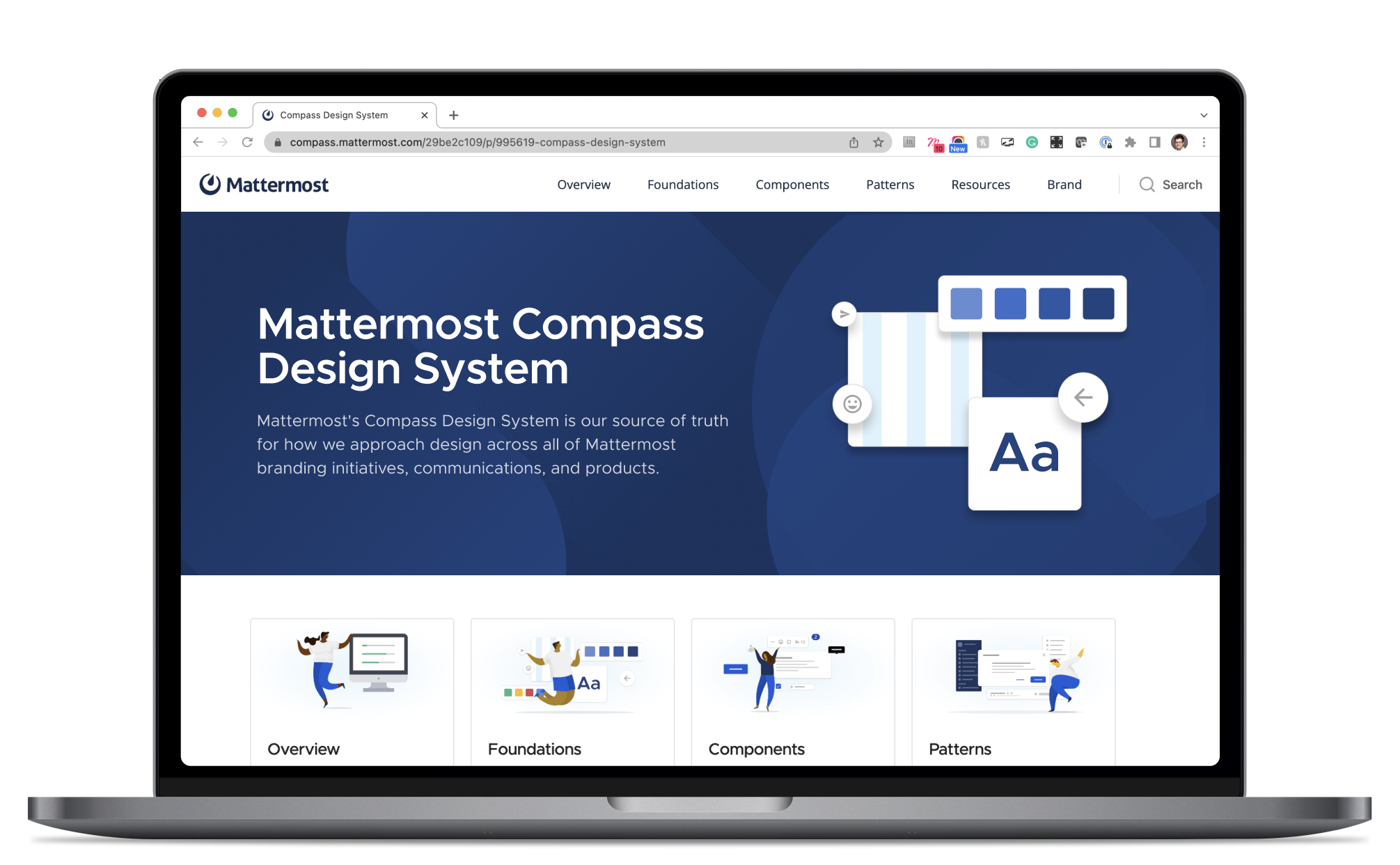
Documenting in Zeroheight
We chose Zeroheight as our primary documentation tool as it enabled us to move fast and publish content with direct links to Figma components. We documented components as we were building them out in Figma, which allowed us to think through all the cases and variants we needed for each component.
You can find the full documentation here.
Outcomes
With a more concrete set of guidelines, components and documentation for design interfaces, the team was able to benefit from:
A strong visual language to draw from that enabled consistency in UI design practices across the design team
Shared terminology for components and patterns that could be understood and used in cross-functional teams
A more cohesive experience across the platform
A serious increase in efficiency with pre-built components that could be leveraged in feature design work, rather than starting from scratch each time
A much stronger foundation as we explored and built new products within the platform
A solid set of guidelines and documentation for developers to reference when building components
Stronger relationships with developers as they adopted the guidelines and practices established


