The foundation
Having previously worked with CitiFinancial to establish the foundations of the brand and having also worked on a new website for them, it was a natural progression to move in to the new and improved loan experience. The brand attributes of helping customers feel ’welcome’, ‘relieved’ and ‘understood’ were always top of mind as we progressed through the project.
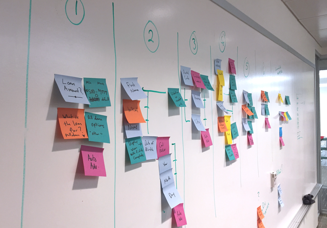
One of many whiteboarding sesions to map out the user flows
Developing the flow
From the gathered requirements and objectives, we began to imagine how users would flow through this process, paying close attention to each piece of data we needed to capture from our users. We looked at the entire experience from offline touchpoints to clicking the ‘apply now’ button on the website, all the way through to the transfer of the funds in to their bank account and paying their loan back. We spent many hours at the whiteboard, iterating with the flow, logical groupings of information and eventually materializing in to sketches of how our users might interact.
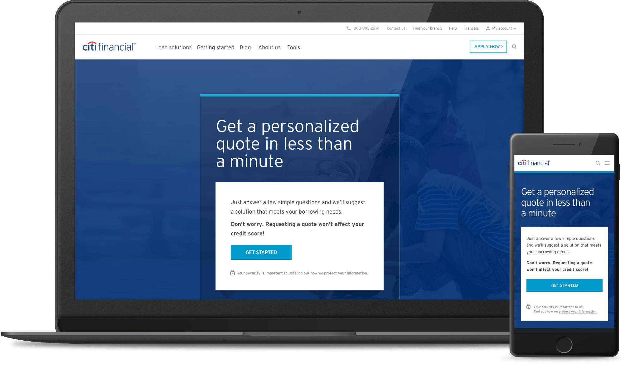
A mobile-first approach
From the outset, we came to an agreement with the client to prioritize mobile users and mobile screens for our design work. This was a significant decision as it demonstrated our clients’ drive to innovate and focus on where the future was pushing them to be. Kudos to CitiFinancial (now Fairstone) for making this leap.
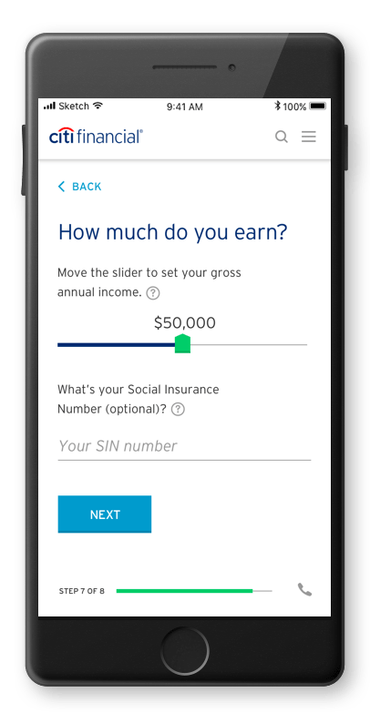
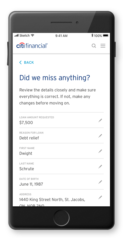
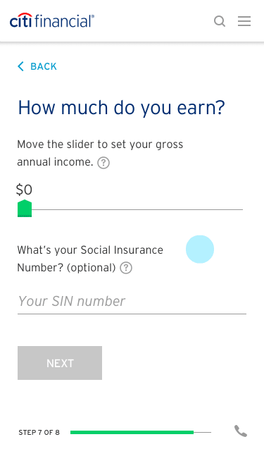
A one-thing-at-a-time approach
CitiFinancial’s previous loan application process, was just one big online form. Not a particularly engaging experience and was pretty jarring for users who clicked a ‘apply now’ CTA only to be presented with a long, intimidating page with a lot of input fields . It felt overwhelming and arduous to complete.
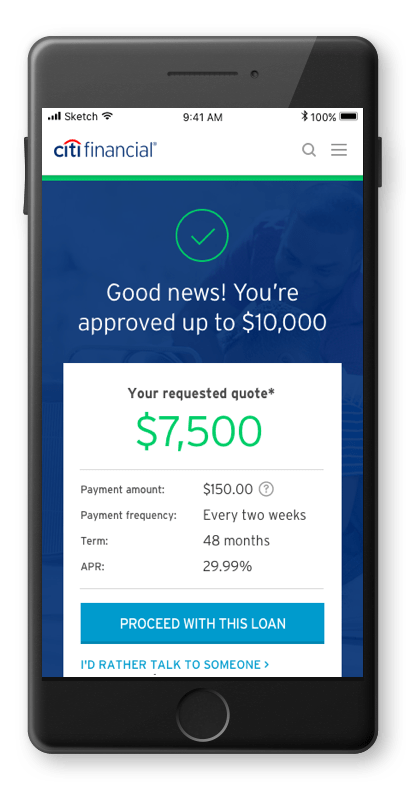
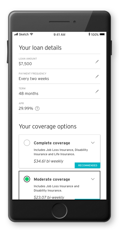
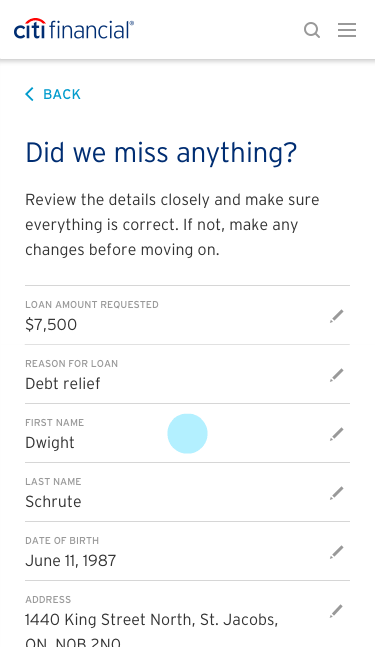
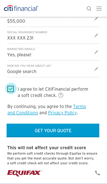
In an effort to provide that sense of relief we were after, our approach was to bring more focus and openness to the process. In the end, we landed on more of a step-by-step approach where users could focus on one grouping of information at a time and then move on to the next step.
Using animation to guide the user
We also began to play with animation effects for all the interactions to share with the client how things could feel and how we could use animation to really guide our users along. We knew this would help add a level of polish to the experience, but we also wanted to ensure each animation was purposeful and helpful to the user along the journey. There was no room for gratuitous animations in this kind of digital experience. We crafted micro-animations right down to the specifics of how text fields react when clicked or how to transition from one question to the next.

The details make the difference
A lot of thinking went in to each and every step of the interaction. Each screen and each user input was thought through in sequence, tested and validated. If an element was not integral to the completion of the task, we dropped it. The goal was to reduce friction for our users at all costs to help them complete their task efficiently.